Login button guidelines
Overview
The "Sign in with LuxID" button is the entry point to the entire authentication flow. It must be instantly recognisable to users who have already encountered LuxID on another service, and trustworthy to users encountering it for the first time. These guidelines reproduce the official LuxID button guideline so your integration stays consistent with every other LuxID Partner.
Following these rules is a requirement of the LuxID Agreement. The official logo files are supplied by LuxID as SVG, PNG, and JPEG; request the brand package from LuxID. Do not recreate the logo yourself.
The mockups on this page use the official single-colour LuxID ID picto (white, magenta, and dark grey). See Logo assets for all the supplied files.
Button modes
There are four approved modes. Each is available as a full pill button (logo plus label) and as an icon-only circular button. Pick the tab that matches the surface your button sits on - the light-background modes for light pages, the dark-background modes for dark pages and dark mode.
- Light mode
- Dark mode
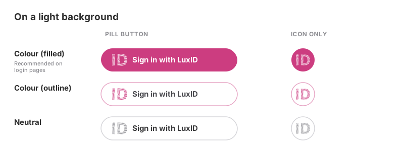
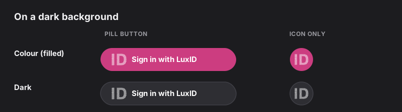
| Mode | Background | Logo and text | When to use |
|---|---|---|---|
| Colour (filled) | LuxID magenta (#CC3D80) | White logo and text | Recommended on login pages - the highest-emphasis option |
| Colour (outline) | White | Magenta logo, dark text, light-magenta border | Light backgrounds where a filled button is too heavy |
| Neutral | White | Grey logo, dark text, grey border | Neutral surfaces where brand colour would clash |
| Dark | Dark grey (around #2E2E33) | White logo and text | Dark backgrounds and dark-mode interfaces |
The icon-only circular variant is permitted (unlike a generic icon button) because it carries the recognisable LuxID logo. Always give it an accessible name with aria-label (see Accessibility).
Sizes and spacing
Two sizes are defined. All paddings and the logo minimum size are fixed, and the height is part of the brand spec.
The corner radius is not fixed. Set it to match the other buttons in your application so the LuxID button feels native rather than bolted on. All three shapes are supported - pill (fully rounded), rounded (e.g. the 16 px used in the dimensions below), and square/rectangular (radius 0). That is why the illustrations differ on purpose: the button modes above use a pill radius while the dimensions below use a 16 px rounded radius. Whatever you choose, apply the same radius to every sign-in option on the screen.
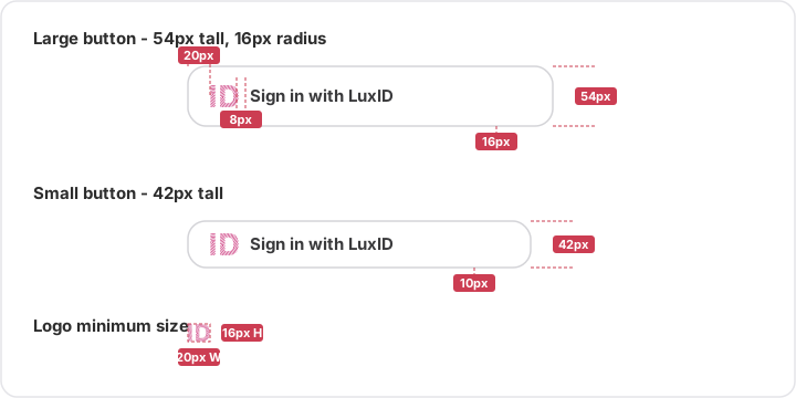
| Property | Large | Small |
|---|---|---|
| Height | 54 px | 42 px |
| Corner radius | Match your app (16 px shown) | Match your app (16 px shown) |
| Left padding (edge to logo) | 20 px | 20 px |
| Gap (logo to text) | 8 px | 8 px |
| Right padding | 16 px | 16 px |
| Vertical padding | 16 px | 10 px |
| Logo minimum size | 16 px tall, 20 px wide | 16 px tall, 20 px wide |
The logo and text are a single grouped unit. Never change the 8 px gap between them, and never let the logo fall below 16 px tall or 20 px wide.
Logo assets
The official assets are supplied by LuxID and are included in this documentation under assets/images/brand/. Do not recreate the logo yourself.
The ID picto for buttons
The logo inside a button is the LuxID ID picto - just the "ID", with no surrounding circle or square. Drop-in, single-colour, transparent-background SVGs are provided so you use the correct glyph (it is the exact official mark, not a redrawing) - pick the colour that matches your button mode:
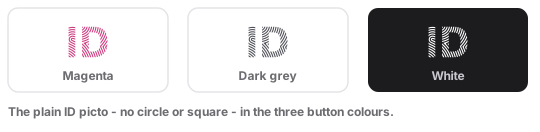
| File | Colour | Use in button mode |
|---|---|---|
luxid-picto-magenta.svg | Magenta #cc3d80 | Colour (outline) |
luxid-picto-darkgrey.svg | Dark grey #515259 | Neutral |
luxid-picto-white.svg | White | Colour (filled) and Dark |
luxid-id.svg | Themeable (one file, CSS classes theme-light / theme-dark / theme-magenta / theme-inverted) | When you inline the SVG and recolour it via CSS |
The full LuxID lockup
The full "LuxID" wordmark is a separate asset from the button ID picto. It is designed to work in colour on both light and dark backgrounds - keep it in colour; do not swap it for a monochrome version in dark mode.
- Light background
- Dark background

| File | Use |
|---|---|
luxid-logo-full.png (plus @2x) | The full LuxID lockup in colour - works on both light and dark backgrounds |
luxid-logo-grey.svg | The full LuxID lockup in grey, for monochrome contexts only |
Icon variants
The icon-only backgrounds (round, rounded square, square) carry their own surface, so they sit on any page colour:
- Light background
- Dark background


| File | Use |
|---|---|
luxid-icon-round.svg, luxid-icon-rounded-square.svg, luxid-icon-square.svg | Backgrounds for the icon-only button |
Allowed button text
Use the user-facing language of your application. The approved phrases below are recommended; you may adapt the typography and the label (for example, shorten to "Se connecter" / "Sign in"), but the wordmark LuxID must always be spelled exactly: capital L, capital I, capital D, no space, no hyphen.
- GB 🇬🇧
- FR 🇫🇷
- DE 🇩🇪
- LU 🇱🇺
- "Sign in with LuxID" (preferred)
- "Continue with LuxID"
- "Connect with LuxID"
- "Se connecter avec LuxID" (preferred)
- "Continuer avec LuxID"
- "Mit LuxID anmelden" (preferred)
- "Mit LuxID fortfahren"
- "Mat LuxID umellen" (preferred)
- "Mat LuxID weidermaachen"
Choosing the right label
The verb matters. LuxID handles both first-time account creation and returning sign-in behind the same button, so pick the label that matches what the user is doing:
- "Sign in with LuxID" - the safe default for a returning-user sign-in screen.
- "Continue with LuxID" - preferred when the same button both creates an account for new users and signs in existing ones. Because LuxID does not distinguish sign-up from sign-in at the button, "Continue" is often the most accurate verb: it reads correctly whether the user is signing in or registering for the first time.
- "Connect with LuxID" - an acceptable alternative when it better fits your product's voice; treat it as equivalent to "Sign in with LuxID". The live LuxID product uses "Sign in with LuxID", so prefer that wording where you want the button to match what users see elsewhere.
- Avoid a separate "Sign up with LuxID" button alongside a "Sign in" one - there is a single LuxID entry point, so two buttons for the same flow only confuse users.
Whatever the verb, the LuxID wordmark stays exact.
Placement and prominence
When your screen offers more than one way to sign in, the major identity providers converge on the same rule, and so does LuxID: give each option fair, consistent treatment.
- Equal prominence. Render the LuxID button at the same size, height, and visual weight as your other sign-in options. Do not make it smaller, lower-contrast, or visually secondary to a competing provider - give every sign-in option fair, equal treatment.
- Consistent shape. Keep all provider buttons the same width and corner radius, stacked vertically and aligned. A coherent set of buttons reads as trustworthy; mismatched ones look improvised.
- Order by likely use. Put the option most of your users will pick first; never bury LuxID under a "more options" fold if it is a primary path.
- One button per action. Show a single LuxID button for a given action on a screen.
- Full-width and stacked on mobile. On narrow screens, make the provider buttons full-width and stack them vertically with even spacing, so the LuxID button stays equal in width to the others.
- Logo before the label. The LuxID logo always sits to the left of the text. This follows the cross-industry "Sign in with" convention - even though a generic navigation button in some design systems (including POST's) places a trailing chevron instead, a provider sign-in button is the recognised icon-before exception.
- No implied endorsement. Do not place the LuxID button or logo where it implies LuxID endorses, sponsors, or is affiliated with your product beyond providing sign-in, and do not use it outside the authentication context.
How LuxID aligns with other providers
LuxID is often shown in a stack next to "Sign in with Google", "Sign in with Apple", "Sign in with Microsoft" and similar. The LuxID spec is deliberately compatible with their published guidelines so a mixed stack looks coherent:
| Provider | Theme / style options | Shape | Font | A notable rule |
|---|---|---|---|---|
| Light, Neutral, Dark | Rectangular or pill | Roboto | Preserve the logo aspect ratio; use an approved asset or compliant custom button (guidelines (opens in a new tab)) | |
| Apple | Black, White, White-outline | Rounded, square, or pill | SF Pro (system) | Corner radius should match the other buttons in your app (HIG (opens in a new tab)) |
| Microsoft | Light, Dark | Rectangular | Segoe UI | "Sign in with Microsoft" may shorten to "Sign in" (guidelines (opens in a new tab)) |
| Brand blue, system | Rectangular / rounded | Helvetica / system | Fixed brand blue and the f logo; equal prominence (guidelines (opens in a new tab)) | |
| Amazon | Gold, light grey, dark grey | Rounded | Ember / system | Use the supplied "Login with Amazon" button images (guidelines (opens in a new tab)) |
| LuxID | Colour (filled), Colour (outline), Neutral, Dark | Pill, rounded, or square (match your app) | Roboto | Logo colours fixed; magenta #cc3d80 fixed on the filled button |
What this means in practice when LuxID sits next to them:
- Height. The common providers cluster around ~40-44 px tall (Google ~40, Microsoft ~41, Apple ~44). LuxID's small (42 px) size lands right in that band - prefer it in a multi-provider stack so every button matches. LuxID's large (54 px) is taller and is better suited to a standalone, primary LuxID-only call to action.
- Shape. Google, Apple and LuxID all support a pill shape, and Apple/LuxID both say match the radius to your app's other buttons - so pick one radius and apply it to every provider button on the screen.
- Font. LuxID and Google both use Roboto, so a Roboto stack is consistent; otherwise each provider's wordmark keeps its own typeface and only the surrounding label follows your app font.
- Equal weight. Every provider's guidelines (and LuxID's) require giving each option equal size and prominence - never make one visually secondary.
Colour and contrast
What you may recolour depends on the mode, and every colour change must keep a contrast ratio of at least 3:1 between adjacent elements (WCAG 2.1 non-text contrast, criterion 1.4.11). For body-text legibility, aim for 4.5:1 between the label and its background where you can.
| You may change | You must not change |
|---|---|
| Border and text colours of the Colour (outline) and Neutral modes (keep 3:1) | The Colour (filled) background - the magenta is fixed |
| The background colour of the Dark and Neutral modes (keep 3:1) | The logo colours in any mode |
| The corner radius and the outer margins | The 8 px gap between logo and text |
The LuxID magenta (#CC3D80) on the filled button is fixed. If your design system conflicts with it, use the outline, neutral, or dark mode rather than recolouring the filled button.
Do's and don'ts
Do
- Increase the outer margins of the button to fit your layout.
- Change the corner radius of the button.
- Change the typography and the label (within the approved phrasing).
- Change the border and text colours of the Colour and Neutral modes, respecting accessibility (3:1).
- Change only the background colour of the Dark and Neutral modes, respecting accessibility (3:1).
Don't
- Reduce the margins below the minimum spacing on this page.
- Stretch or distort the button elements - the logo must keep its proportions.
- Invert the elements - the logo always sits to the left of the text.
- Change the background colour of the Colour (filled) mode.
- Change the colour of the logo.
- Change the spacing between the logo and the text.
Accessibility and states
Touch target
The minimum interactive touch area is 44 x 44 px on iOS and 48 x 48 dp on Android. The large button (54 px) already exceeds this. The small button (42 px) is just under, so extend its clickable area with invisible padding to reach 44 px - do not shrink the visual button.
Icon-only buttons
The icon-only circular variant must carry an accessible name, because there is no visible text:
<button class="luxid-btn luxid-btn--icon" type="button" aria-label="Sign in with LuxID">
  <img src="/assets/luxid-picto-white.svg" alt="" aria-hidden="true" width="20" height="20" />
</button>
Interaction states
| State | Treatment |
|---|---|
| Hover | 10% brightness reduction on the background; cursor: pointer |
| Focus (keyboard) | 3 px solid outline in a high-contrast colour; outline-offset: 2px |
| Active / pressed | 15% brightness reduction on the background |
| Disabled | 40% opacity; cursor: not-allowed |
Examples
A login screen offering email/password, then LuxID and another provider as equally weighted options. The LuxID button is the recommended Colour (filled) mode, the same size as the sibling provider button - never smaller.
- Light mode
- Dark mode
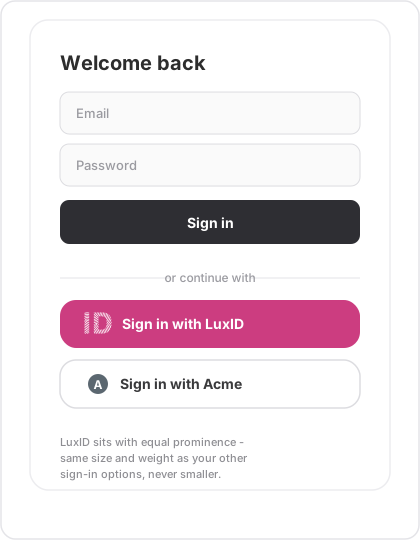
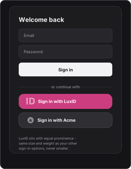
Show a single "Sign in with LuxID" (or "Continue with LuxID") button. Do not present a separate "Sign in" and "Create account" pair for LuxID, and do not add your own LuxID username/password fields. The LuxID Universal Login page presents the sign-in and account-creation options itself after the redirect, so a second LuxID button only duplicates what LuxID already offers. See Mapping LuxID identities to your application for what your app does once the user returns.
CSS reference implementation
A reference starting point. Adjust font-size to match your design system. Keep the magenta, the logo colours, the 8 px gap, and the minimum dimensions.
Typography. LuxID uses Roboto as its typeface. Roboto is free for commercial use under the Apache License 2.0 (opens in a new tab), so you can self-host or load it from Google Fonts without a licence fee. If your application already has an established type system, you may keep your own font on the button instead - legibility and the fixed dimensions matter more than the exact typeface.
@import url('https://fonts.googleapis.com/css2?family=Roboto:wght@400;500;700&display=swap');
/* Base - shared by all modes */
.luxid-btn {
  display: inline-flex;
  align-items: center;
  gap: 8px;                 /* fixed logo-to-text gap */
  min-height: 54px;         /* large; use 42px for small */
  padding: 0 16px 0 20px;   /* 20px left to logo, 16px right */
  border-radius: 16px;      /* match the other buttons in your app */
  font-family: 'Roboto', system-ui, 'Segoe UI', sans-serif;
  font-size: 1rem;
  font-weight: 700;
  line-height: 1;
  cursor: pointer;
  text-decoration: none;
  white-space: nowrap;
  border: 1.5px solid transparent;
  transition: filter 0.15s ease, background-color 0.15s ease;
}

.luxid-btn__icon {
  display: block;
  width: auto;
  min-width: 20px;
  height: 20px;             /* never below 16px */
  flex-shrink: 0;
}

.luxid-btn:focus-visible {
  outline: 3px solid #cc3d80;
  outline-offset: 2px;
}

.luxid-btn:disabled,
.luxid-btn[aria-disabled="true"] {
  opacity: 0.4;
  cursor: not-allowed;
}

/* Colour - filled (recommended on login pages). Background is fixed. */
.luxid-btn--colour {
  background-color: #cc3d80;
  color: #ffffff;
}
.luxid-btn--colour:hover { filter: brightness(0.9); }
.luxid-btn--colour:active { filter: brightness(0.85); }

/* Colour - outline */
.luxid-btn--outline {
  background-color: #ffffff;
  color: #4a4a4f;
  border-color: #e7a6c5;
}

/* Neutral */
.luxid-btn--neutral {
  background-color: #ffffff;
  color: #3a3a3c;
  border-color: #d4d4d8;
}

/* Dark */
.luxid-btn--dark {
  background-color: #2e2e33;
  color: #ffffff;
}
.luxid-btn--dark:hover { filter: brightness(1.15); }

/* Small size */
.luxid-btn--small {
  min-height: 42px;
  padding: 0 16px 0 20px;
}
HTML pattern
<!-- Colour (filled) - recommended on login pages -->
<a class="luxid-btn luxid-btn--colour" href="/auth/luxid" role="button">
  <img class="luxid-btn__icon" src="/assets/luxid-picto-white.svg" alt="" aria-hidden="true" width="20" height="20" />
  Sign in with LuxID
</a>

<!-- Colour (outline) uses the magenta ID picto -->
<a class="luxid-btn luxid-btn--outline" href="/auth/luxid" role="button">
  <img class="luxid-btn__icon" src="/assets/luxid-picto-magenta.svg" alt="" aria-hidden="true" width="20" height="20" />
  Sign in with LuxID
</a>

<!-- Neutral uses the dark-grey ID picto -->
<a class="luxid-btn luxid-btn--neutral" href="/auth/luxid" role="button">
  <img class="luxid-btn__icon" src="/assets/luxid-picto-darkgrey.svg" alt="" aria-hidden="true" width="20" height="20" />
  Sign in with LuxID
</a>
Why alt="" plus aria-hidden="true"? This is intentional for the pill button: the visible text already conveys meaning. For the icon-only variant, drop aria-hidden and put the label in aria-label on the button instead.
Downloadable assets
The official assets are supplied by LuxID. Until the LuxID Console hosts them, request the brand package from LuxID.
| Asset | Format | Variants |
|---|---|---|
| LuxID logo | SVG, PNG, JPEG | White (for Colour-filled and Dark), Colour (for Outline and Neutral) |
| Full button | SVG | All four modes, large and small, all four languages |
Common integration patterns
React
export function LuxIDSignInButton({ locale = 'en', mode = 'colour', href }) {
  const labels = {
    en: 'Sign in with LuxID',
    fr: 'Se connecter avec LuxID',
    de: 'Mit LuxID anmelden',
    lb: 'Mat LuxID umellen',
  };

  // Pick the single-colour ID picto that matches the button mode.
  const icons = {
    colour:  '/assets/luxid-picto-white.svg',     // filled magenta button
    dark:    '/assets/luxid-picto-white.svg',     // dark button
    outline: '/assets/luxid-picto-magenta.svg',   // white button, magenta ID
    neutral: '/assets/luxid-picto-darkgrey.svg',  // white button, grey ID
  };
  const icon = icons[mode] ?? icons.colour;

  return (
    <a href={href} className={`luxid-btn luxid-btn--${mode}`} role="button">
      <img src={icon} alt="" aria-hidden="true" width={20} height={20} />
      {labels[locale] ?? labels.en}
    </a>
  );
}
Vanilla JavaScript (locale from <html lang>)
(function () {
  const labels = {
    en: 'Sign in with LuxID',
    fr: 'Se connecter avec LuxID',
    de: 'Mit LuxID anmelden',
    lb: 'Mat LuxID umellen',
  };

  const lang = (document.documentElement.lang || 'en').split('-')[0];
  const label = labels[lang] || labels.en;

  document.querySelectorAll('.luxid-btn').forEach(function (btn) {
    const textNode = btn.childNodes[btn.childNodes.length - 1];
    if (textNode && textNode.nodeType === Node.TEXT_NODE) {
      textNode.textContent = ' ' + label;
    }
  });
}());
Related pages
- Brand assets and visual identity - full logo and colour palette rules
- Accessibility and localisation - ARIA, keyboard navigation, the
langparameter - Add Login - the technical redirect integration behind the button